Dynabrands Site Design
OVERVIEW
MY ROLE
RESEARCH & DISCOVERY
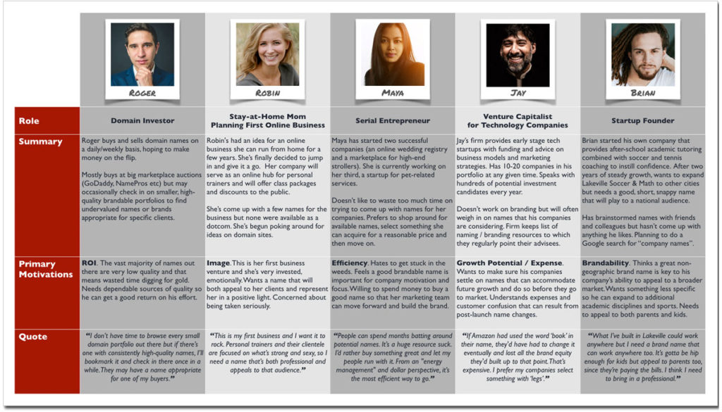
The spectrum of potential brand/domain buyers is broad, so I developed a suite of personas to help keep the perspective of each in focus. User types were distilled from articles, web forums, blog posts and other industry sites.
Personas Overview
IDEATION & SKETCHING

Early site / concept map

Early design sketches
DESIGN SOLUTIONS
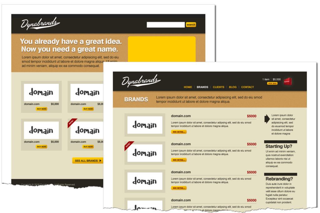
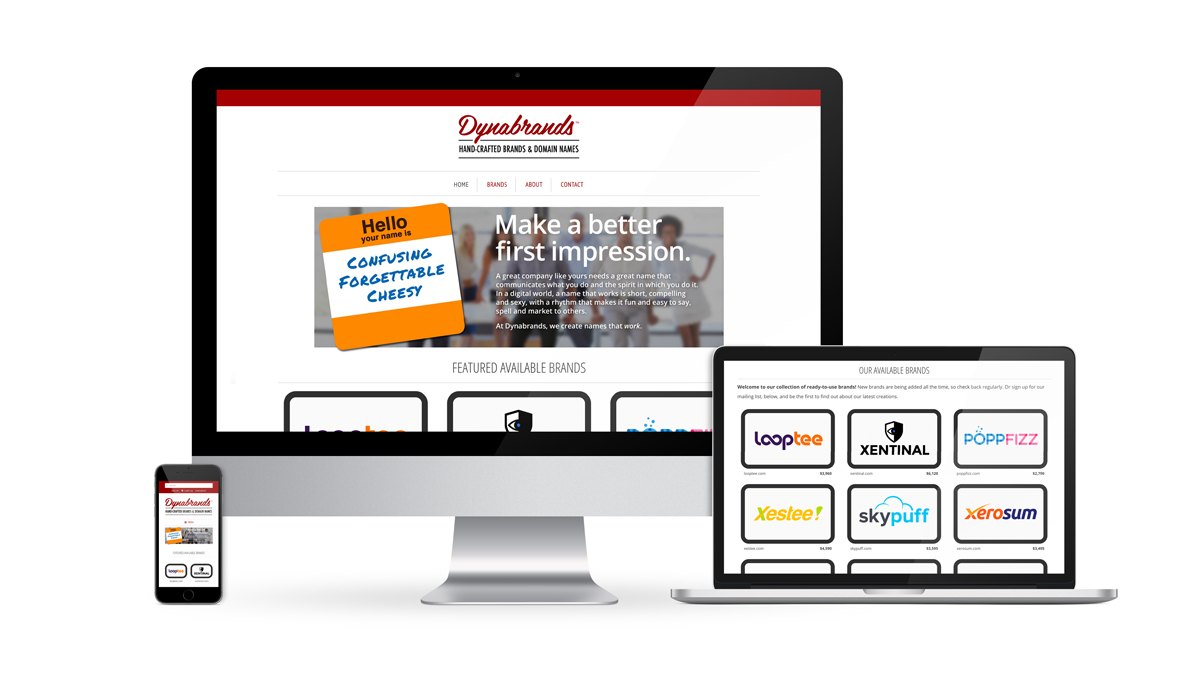
As the project progressed, it became clear that the site needed a more subtle design that would allow the company’s products (brand names and logos) to take center stage. This led to a cleaner, lighter approach. I simplified the palette, using a white background and a single iconic brand color and employed a lean, condensed geometric typeface. The resulting design maintains the original shop structure while providing a more neutral field that no longer competes with the items available for sale.
To align with this product-first approach, I updated the logo treatment as well. The new logo sits back a bit — again, to give more prominence to the product. It combines an industrial feel with the romance of American aerospace firms of the 1940s and 50s (the original inspiration for the company name). The wordmark links the brand to an era of individual engineers and craftsmen creating cutting edge products for a burgeoning technological age. We felt this treatment captured both the mission of the company and the entrepreneurial startup environment of its target market.
Final designs


